

The champions league of logo design
Does MidJourney understand negative space?

I consider icons using negative space the champions league of logo design. Not only does it require skill to create them, it also adds something to a logo that one could describe as semantic depth. To me, it just makes an icon or logo more intelligent.
Does a multi-modal model like MidJourney understand negative space?
Human-designed negative space logos
Here is a selection of my personal favourites in the realm of negative space logos. Of course, some of the more popular ones are the arrow in the FedEx logo.
The logo of the “The Guild of Food Writers” (Link) is as simple as it is brilliant. It combines the tip of a fountain pen with the icon of a spoon in the negative space.

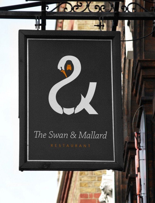
The logo of “The Swan & Mallard” Restaurant is just fantastic. Not only is the duck (mallard) visible in the negative space of the swan. The swan itself also resembles the ampersand (“&”) sign of the name.
Whereas the above logo is rather complex, the following icon is semantically at least as deep but much simpler.
Designer Alex Johnson (project on Behance) proposed this negative space icon for the front cover of Moby Dick.

The icon does not only combine the fluke of the whale with the letter “M” of Moby Dick. It also shows the tip of the harpoon used in whaling. The icon foreshadows what is to come in the story.
AI-generated negative space logos
For the following logos or icons, I used MidJourney (Link). I do not have access to DALL-E 2 or Imagen. I am not affiliated with any of the tools or companies behind them.
The quality of the results will very much depend on the “prompt engineering”. If you are able to achieve better results with different prompts, please let me know in the comments below this article.
The exact prompts used to generate the respective images are shown in quotes as captions underneath the images. All images below are generated using MidJourney.
Recreating the Guild of Food Writers logo
One attempt was to recreate the rather simple icon of the Guild of Food Writers. Obviously, this experiment was not aimed at testing the creative abilities of MidJourney. Instead, I wanted to test the required prompt engineering. How does a prompt need to be phrased to get a good result?
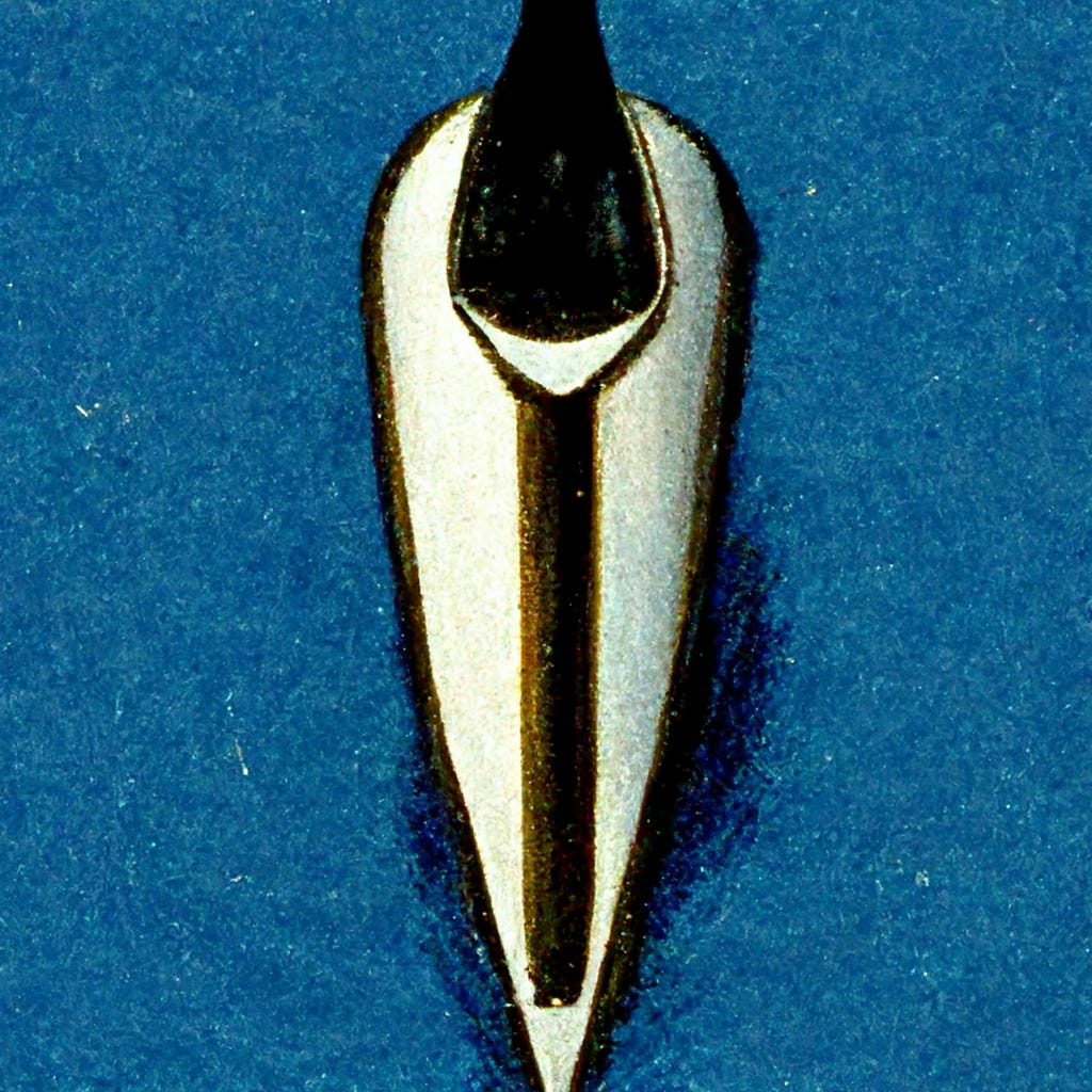
The first problem was that I did not know the technical term for the tip of a fountain pen. It appears to be called a “nib” (Wikipedia). The actual tip is just the very end that touches the paper. The so-called “Breather Hole” and the connected slit are the parts that resemble a spoon in the logo.
I think MidJourney knew that already.


I then tried to describe the remaining aspects of the logo.
Icon of a fountain pen nib, seen from the top, negative space, breather hole and slit resemble a spoon
This was the first result I got.

Initially, I was not impressed. But then the image in the top left corner caught my eye. I upscale the image which does not only increase the resolution but sometimes adds additional details and twists.

The style of the image is not quite right for a negative space logo. But it took just much fewer iterations than I had anticipated to create a combination of nib and spoon. By creating more variations of this image, one can explore the adjacent latent space.
I wish it was possible to take a result and then just add an additional prompt to nudge the result into the right latent space direction.
But in order to make the image black and white, I had to start a new image generation process.
Icon of a fountain pen nib, seen from the top, negative space, breather hole and slit resemble a spoon, black and white
Here the results as I got them:


I am not getting what I want. And so I tried a different prompt.
Negative space logo of a fountain pen nib resembling a spoon

The image in the upper left corner caught my eye. The variations I was able to create from it are not too far off from what I had in mind.


Creating new negative space logos
The re-creation of existing logos can be frustrating. In the best case I get what I had in mind already. And so I tried to create some new logos.
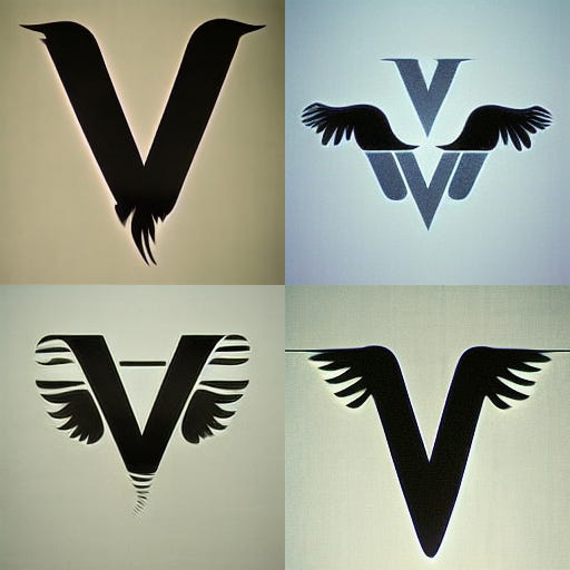
Letter V and eagle’s wings
Negative space logo of the letter V resembling an eagle's wings
The results are stunning — even if they are not exactly negative space logos.

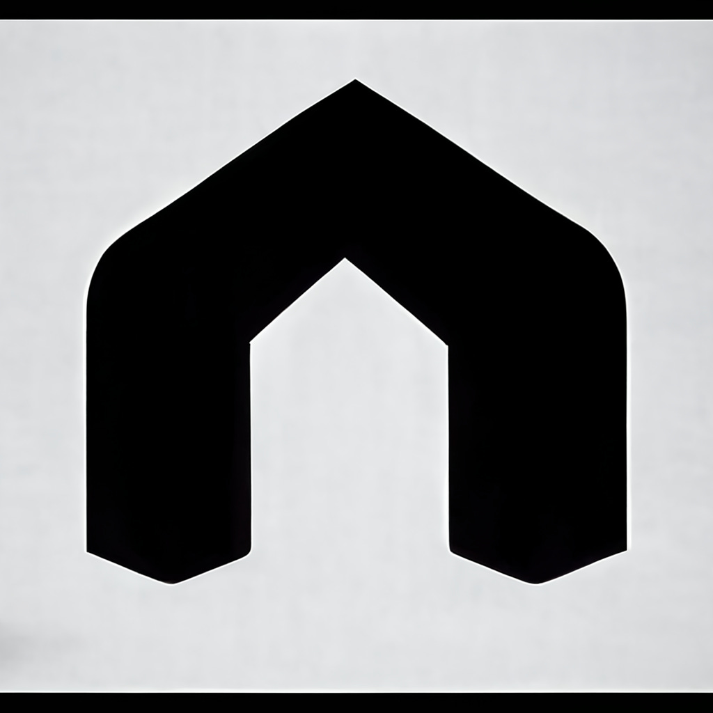
Wrench resembling a house
The following results are a selection of the best generated images of a …
Negative space logo of a wrench resembling a house
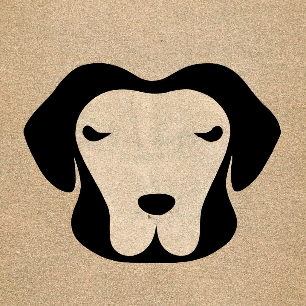
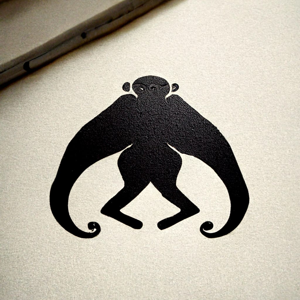
Monkey

Dog
The following logo was generated without the “negative space” description in the prompt.

By adding “negative space”, one can nudge MidJourney into the direction of black-and-white logos where inner parts have been cut out.
Conclusion
The results generated by MidJourney are stunning.
The text descriptions of images appear to have led MidJourney to roughly understand what negative space logos are. However, it turns out to be difficult to enforce that all generated images actually use negative space.
If one has a specific outcome in mind, recreating it easily becomes tedious. It turns out it is not that easy to describe a desired outcome.
In those cases it appears that we need another AI layer between the multi-modal model and the user. That layer needs to understand what is there in the latent space and what is desired by the user. It needs to help with the prompt engineering and potentially guide the user.
It wold also be more efficient if an existing result could be nudged into a new direction as described by an additional, follow-up prompt.
In terms of getting inspired by new creations, MidJourney is just stellar. It takes very little time to create surprising, aesthetically pleasing results.
When it comes to logos in particular, aspects of copyright and trademark law become crucial. Even though MidJourney results can be used commercially, there is no guarantee that resulting logos do not infringe on existing ones. In fact, it is even likely given that MidJourney has been trained on existing works of art.
On the other hand, it is obvious that tools like MidJourney can indeed create logos that are novel and surprising to the user. And be it by combining existing visual concepts that were previously unrelated.
Notable bycatch
The following logos are bycatch. They deserve to be shown but did not actually use negative space.
Monkey
Interestingly, generated logos for a “monkey business logo” tend to include the letter “M”. The following logo is excellent — but unfortunately not a negative space logo.
Letter O resembling an octopus
The following logo is not technically a negative space logo — but it is still a stunning result based on a simple prompt.

Squid resembling a magnifying glass
An imaginary company “SquidSearch” could probably use a logo like this:

Notes:
There may be ninja edits of this post — adding further results and clarifying thoughts.
I only have access to MidJourney at the moment. I would love to also test DALL-E 2 and Imagen. I am not affiliated with any of the tools or companies.